Our logo brings to life the unification of the diverse groups of people that make up our district.
Full Color Logo
The logo reflects our diversity with colorful and overlapping features that provide a sense of visual depth, boldness, and vibrancy.
Each version of our logo has a different purpose. Please follow the usage guidelines to ensure our logo retains its impact as the official logo of our district.
One Color Logo
Using our logo in a more simplified, one color format allows for the flexibility in background colors. This treatment also helps leverage the unique colors associated with our audiences.
Logo lockup
Along with our logo mark is a specially designed word mark treatment. When paired together, they form our official logo lockup.
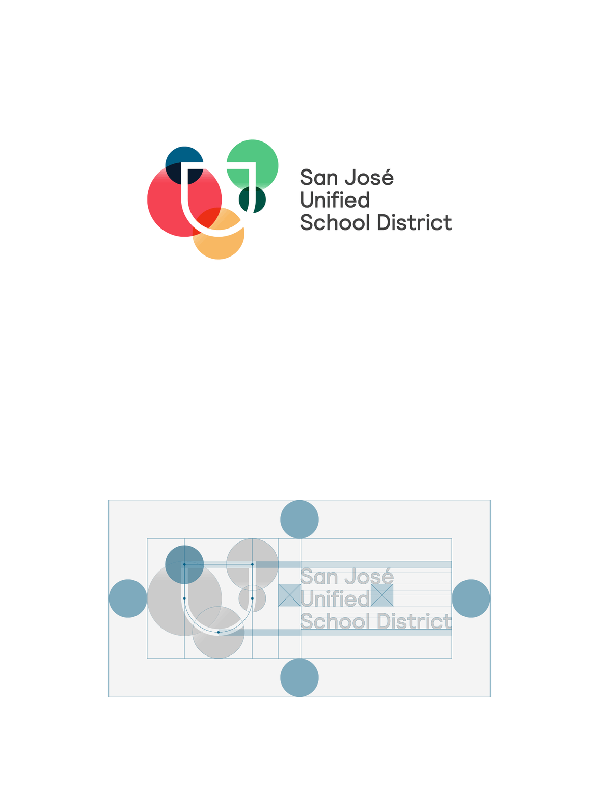
This demonstrates how our lockup is structured. Notice the space surrounding the lockup — a clear space. This ensures the logo will not clash with it’s surroundings. It’s important to maintain this clear space so that our logo and lockup are always legible and recognizable.
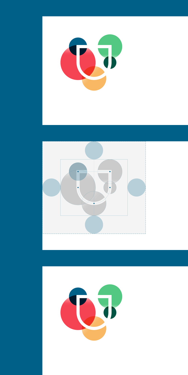
Mark
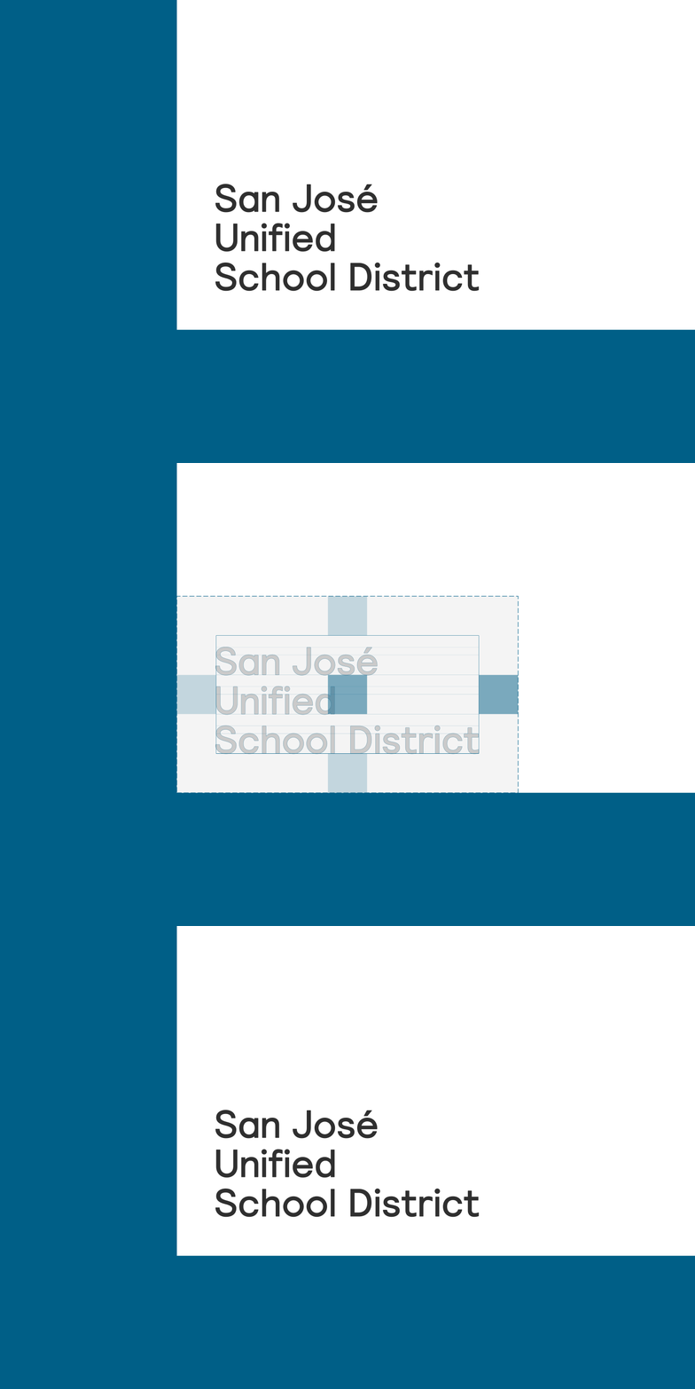
Word Mark
Sizing
To ensure legibility, we've set a minimum logo size for both print and digital applications.
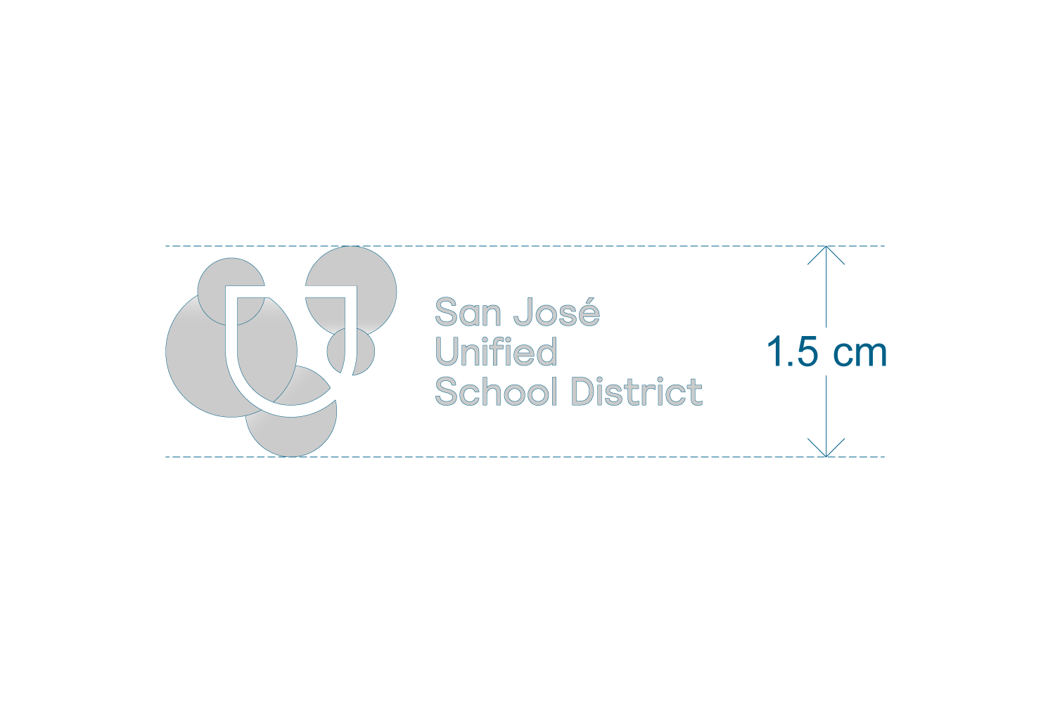
Minimum logo size for print applications is 1.5cm in height
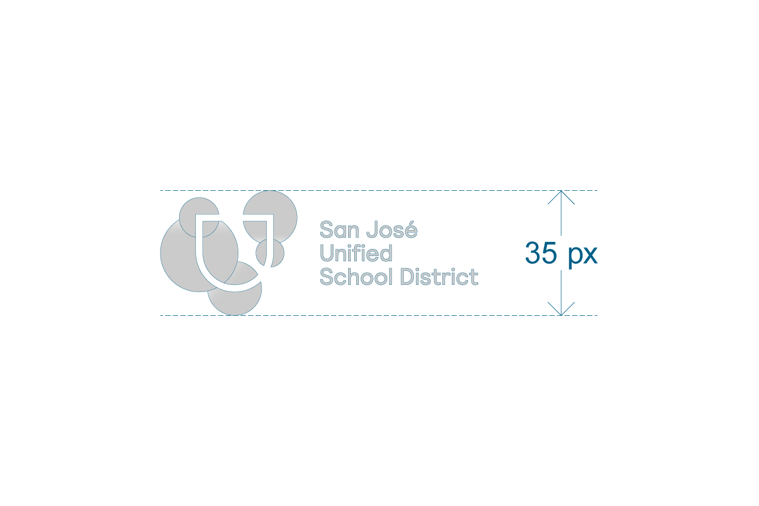
Minimum logo size for digital applications is 35px in height
Misuse
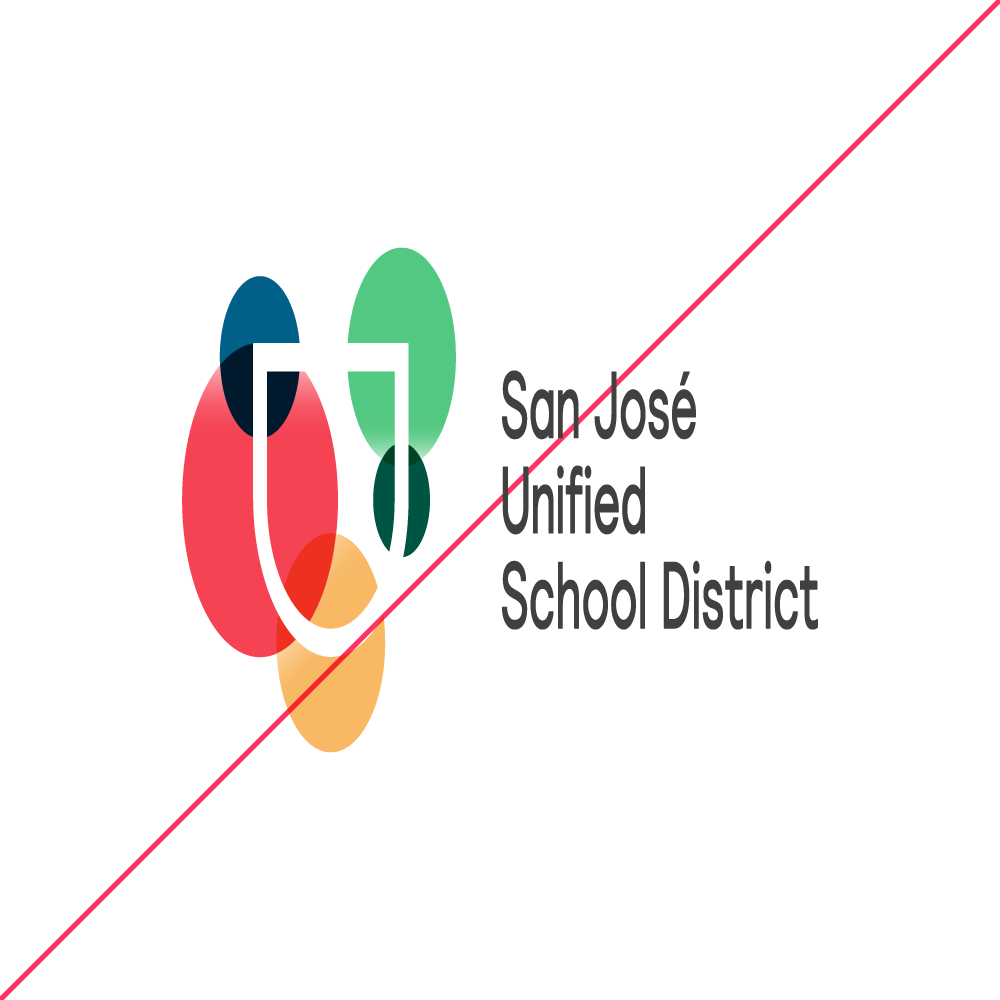
Do not distort, rotate, or flip the logo.
Do not set the logo in any color outside of the versions provided.
