
We’re building a new visual language for Toyota Gazoo Racing to better the experience for our amazing fans. Maintaining a consistence look, feel, voice and behavior, will provide our fans with a more intuitive and memorable experience.
This guide breaks down the fundemental elements of our new online experience. From color to type, copy to imagery, we use these elements with purpose, delivering a confident and genuine TGR experience.
We use color very deliberately within our experience. Leveraging the core colors from the Toyota Gazoo Racing identity, this simple system creates a stronger connection between racing fans and a global Toyota message.
Type is a great way to express our style — simple, direct, with a balance of technology and humanity. Our type styles help reinforce our superior technical skills while remaining legible at all levels.
We use Decima Mono Pro primarily for key headlines, section titles, and global messages. We also use Akkurat Mono for body copy and secondary messaging. Below is a general break down of our type styles.
Body 02
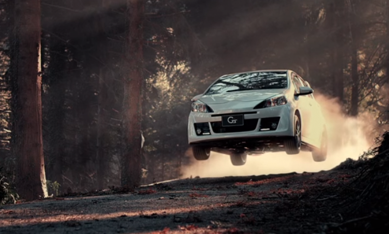
Our grid system is modular and responsive, based off a 12 column grid structure with 24px gutter between columns. Our columns are fluid, allowing it to adapt accordingly for mobile formats, while our gutters remain constant.
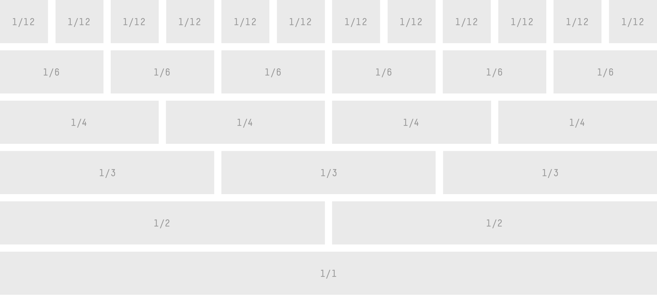
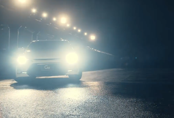
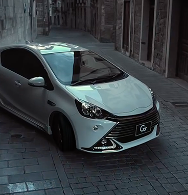
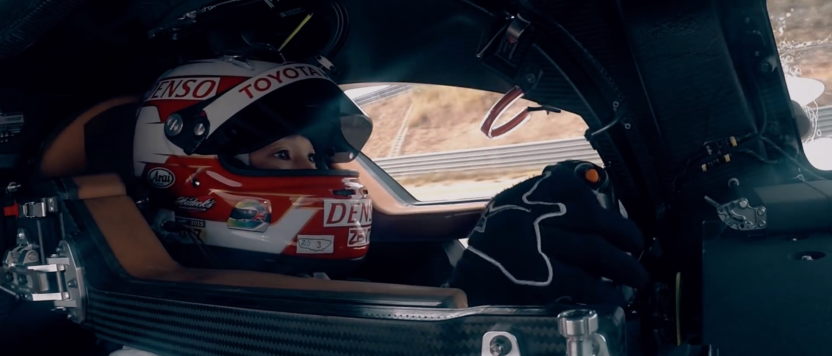
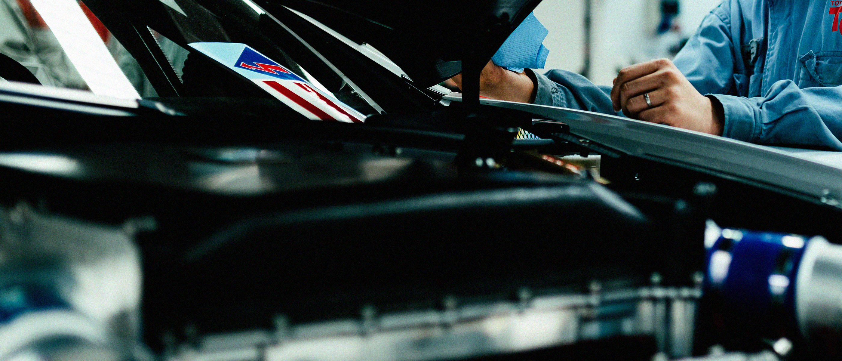
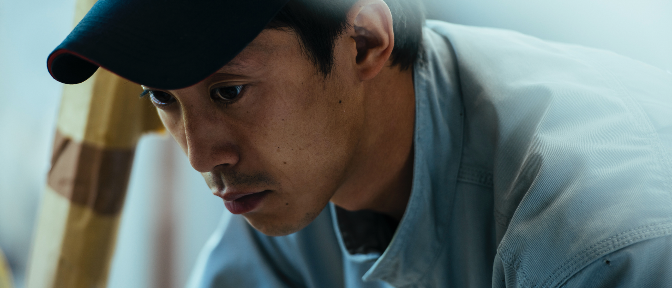
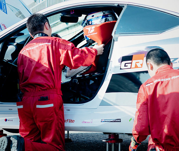
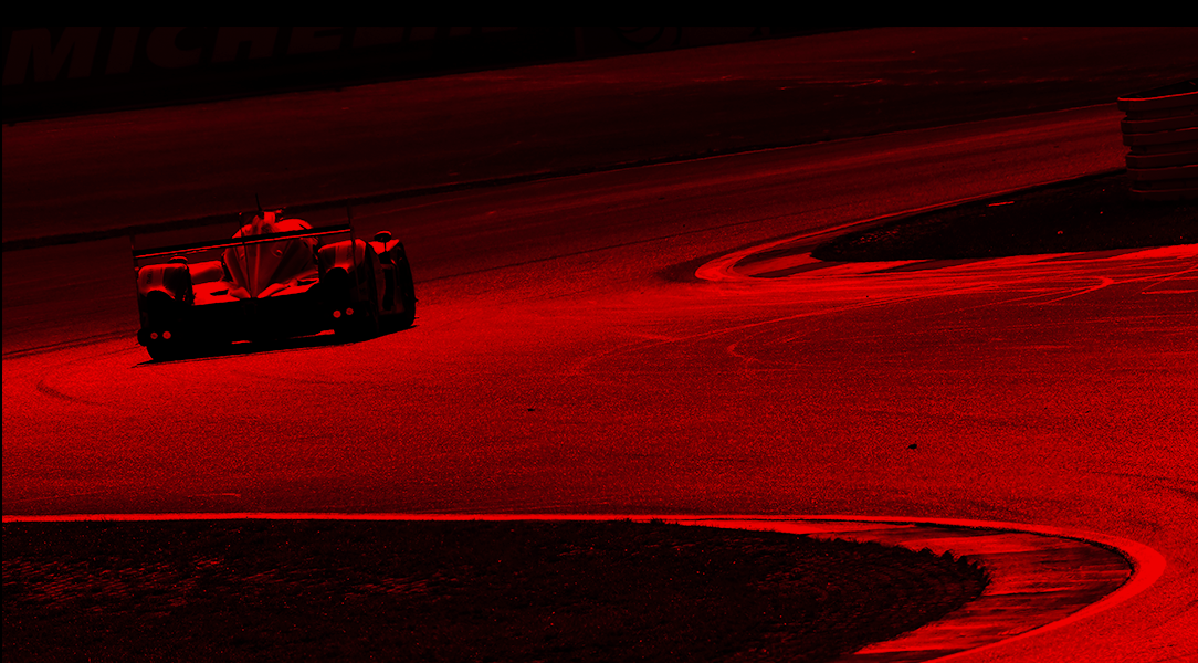
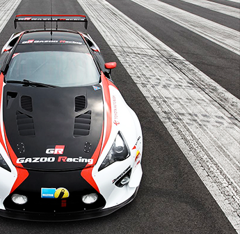
Imagery plays a large part in the TGR experience. It helps our fans re-live the excitement of a race and gets them behind the action, access to the team and the people who make TGR what it is today. Here you’ll see the various way our site uses imagery and the unique methods of interacting with the content.
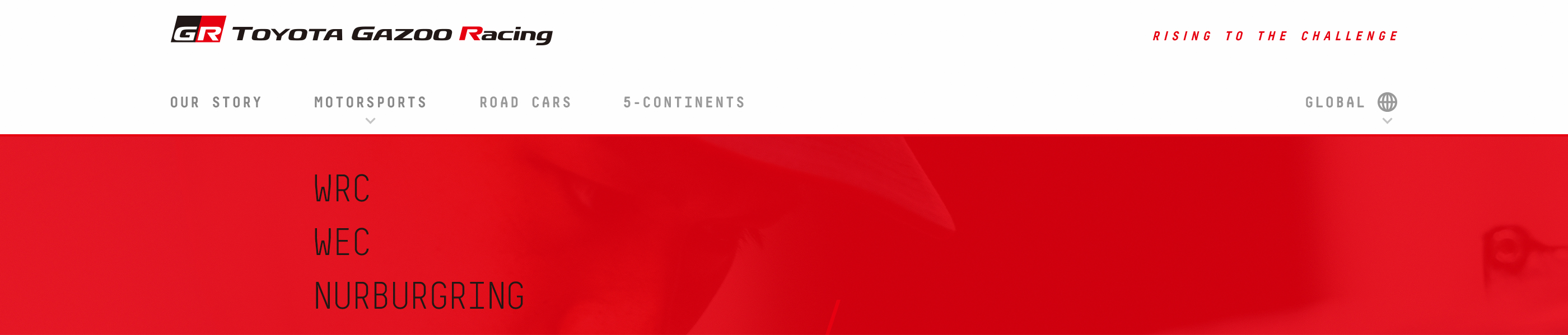
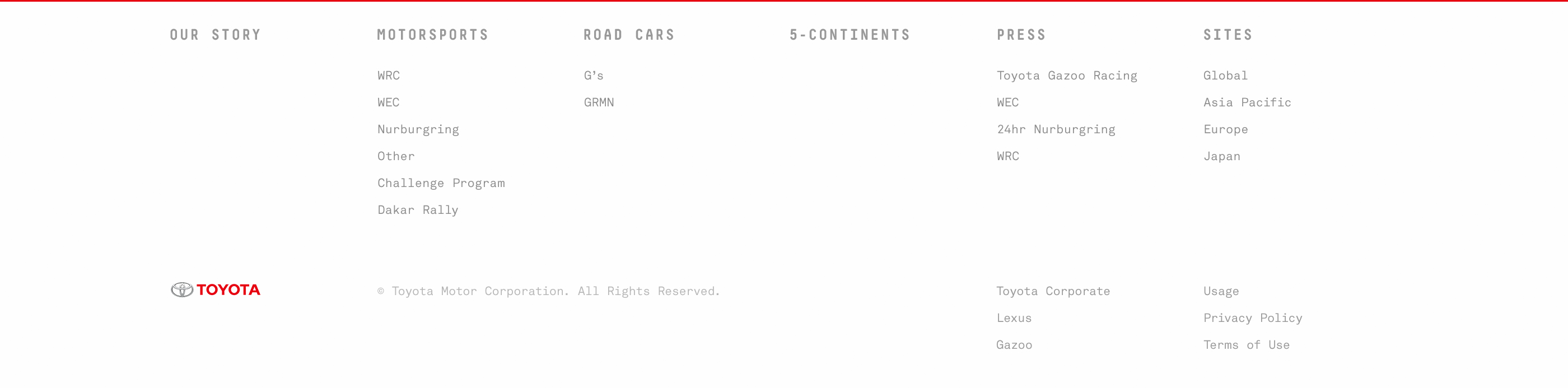
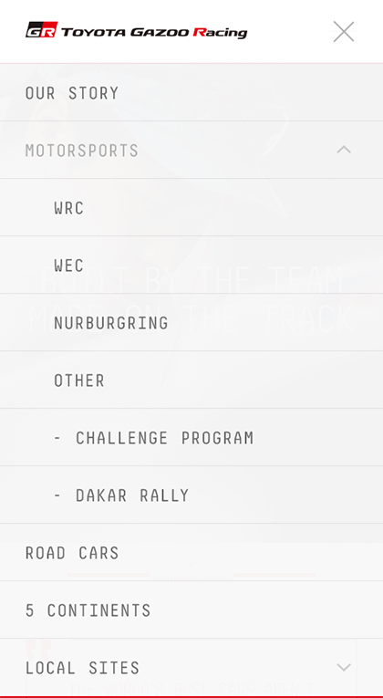
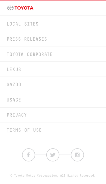
Our navigation system is simple and intuitive, allowing the user to get straight to the content they care about. Below are examples of our top header and footer navigations for desktop and mobile formats.


Calls to action, typically in the form of buttons, help the user identify how to engage further. Within our system, these actions are simple, direct and especially consistent.
Special text carousels can help users quickly navigate through information. Here you’ll see how the links slide into place, always anchored to the static arrow.
We hope this gives you a good overview our site elements and encourages you to create the best experience for our fans.
Thanks
DesignStudio