Chick-fil-A
Rebrand & Web Style Guide
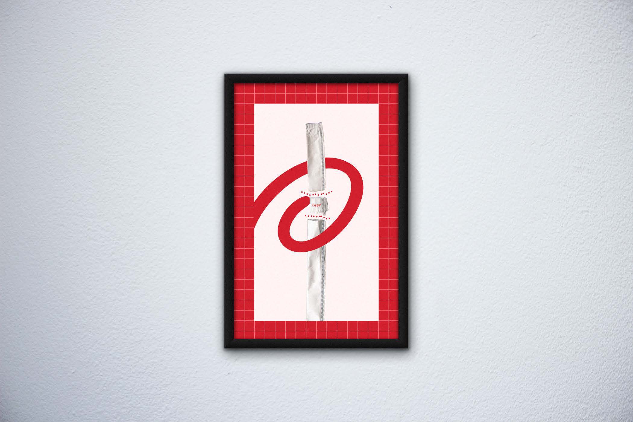
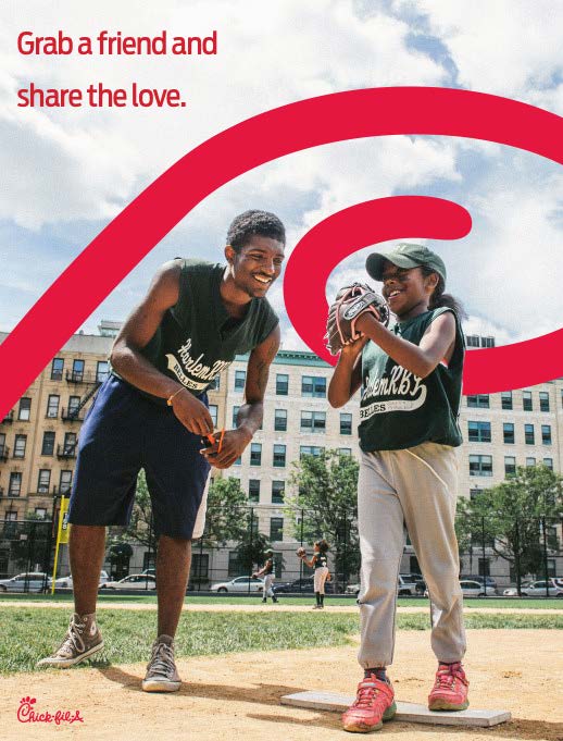
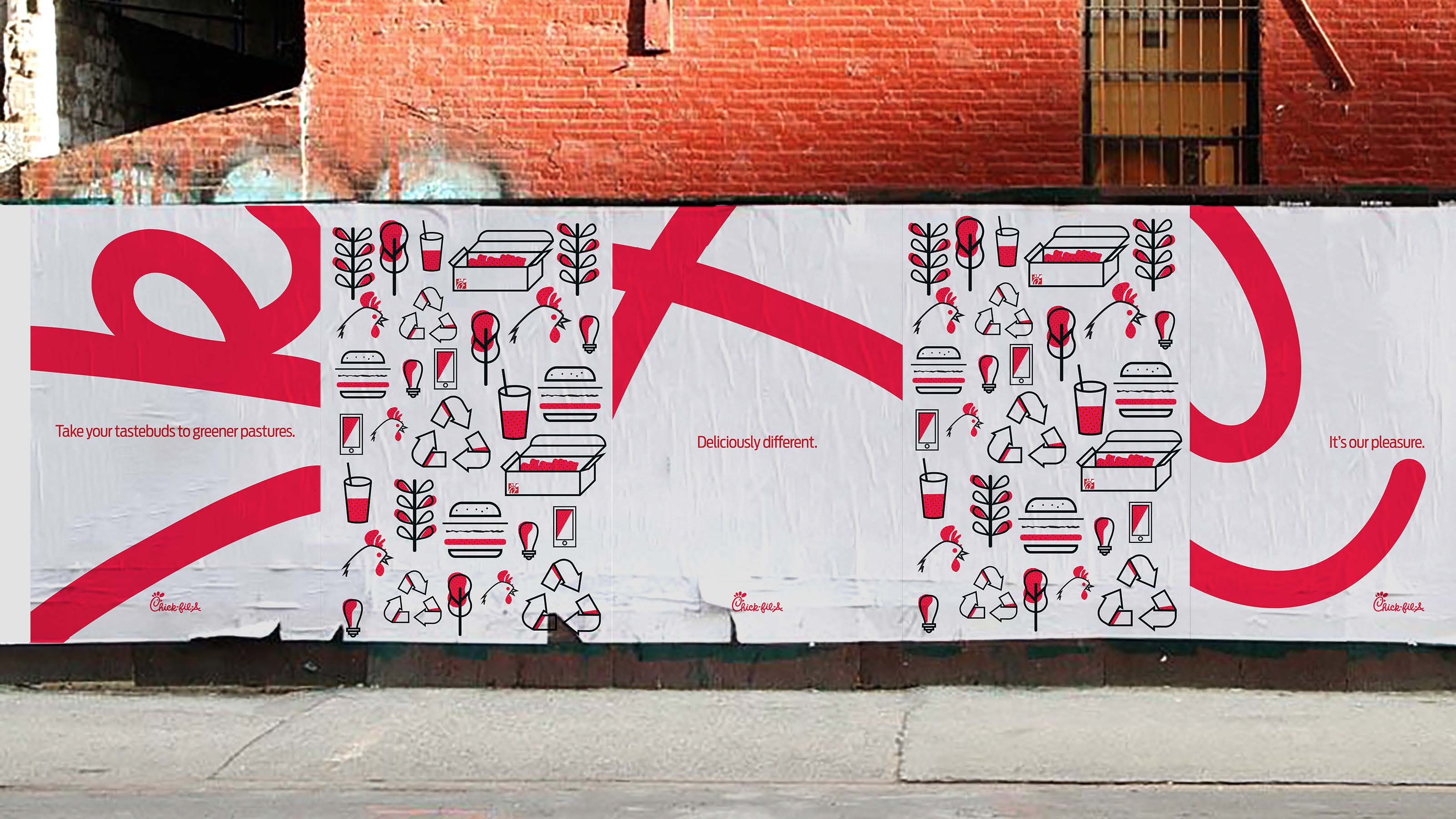
Wow! What a crazy long project. Still going over a year strong. Everyone at our studio and freelancers have touched this project at some point or another. My role early on was on helping explore a few different territories and flush out posters, bags, and random applications.
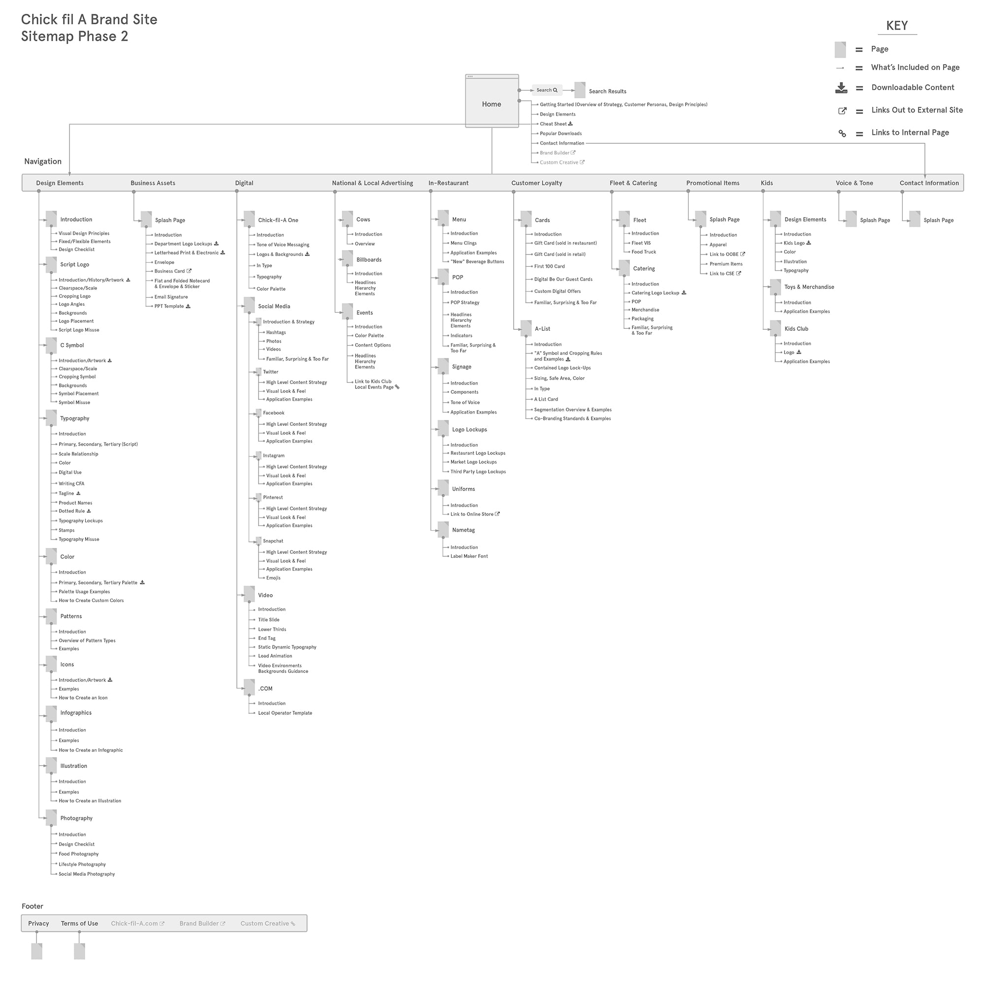
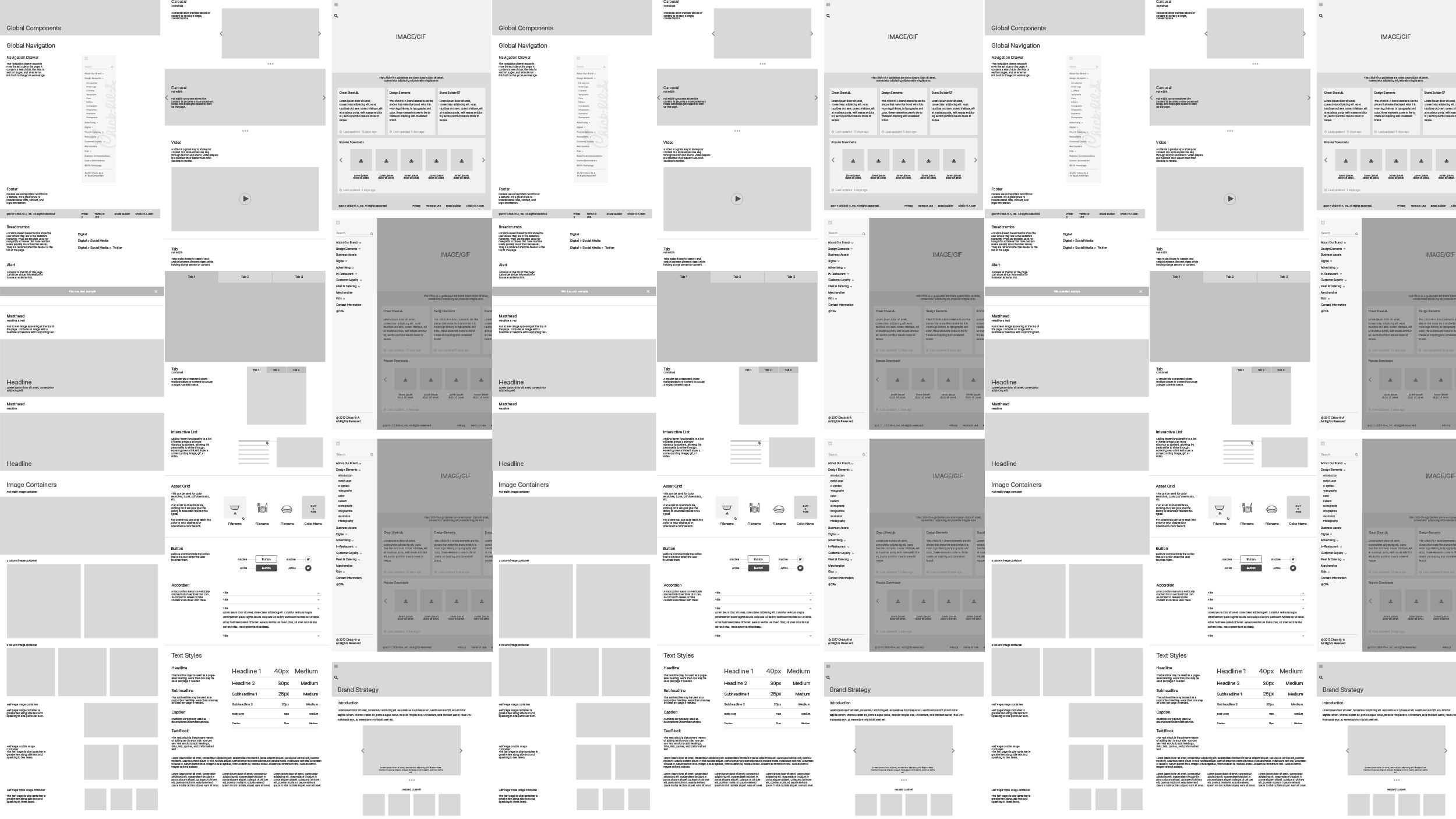
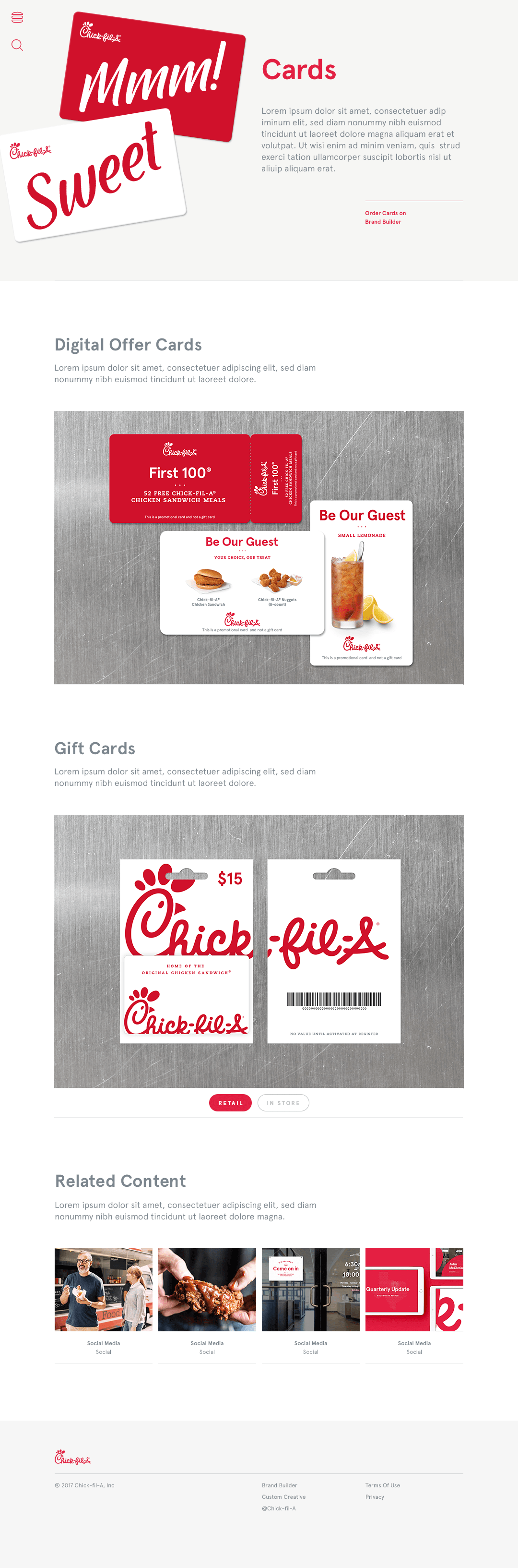
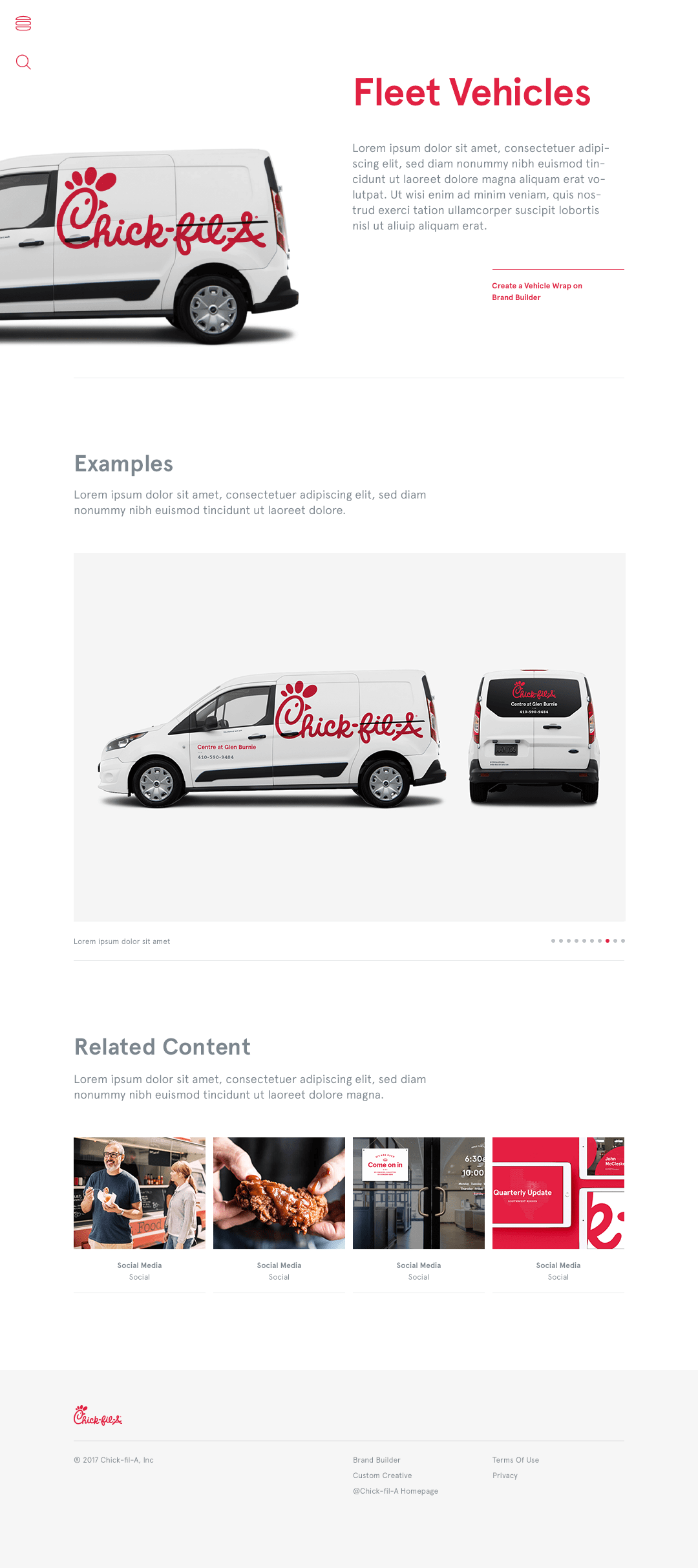
Later I came back on the project to create their massive Web Style Guide (example above) for operators and agencies. It consists of EVERYTHING from wayfinding signs, to colors, to video & animation. This was a huge rebrand for Chick-fil-A and as they grow they were very concered with maintaining their consistency.


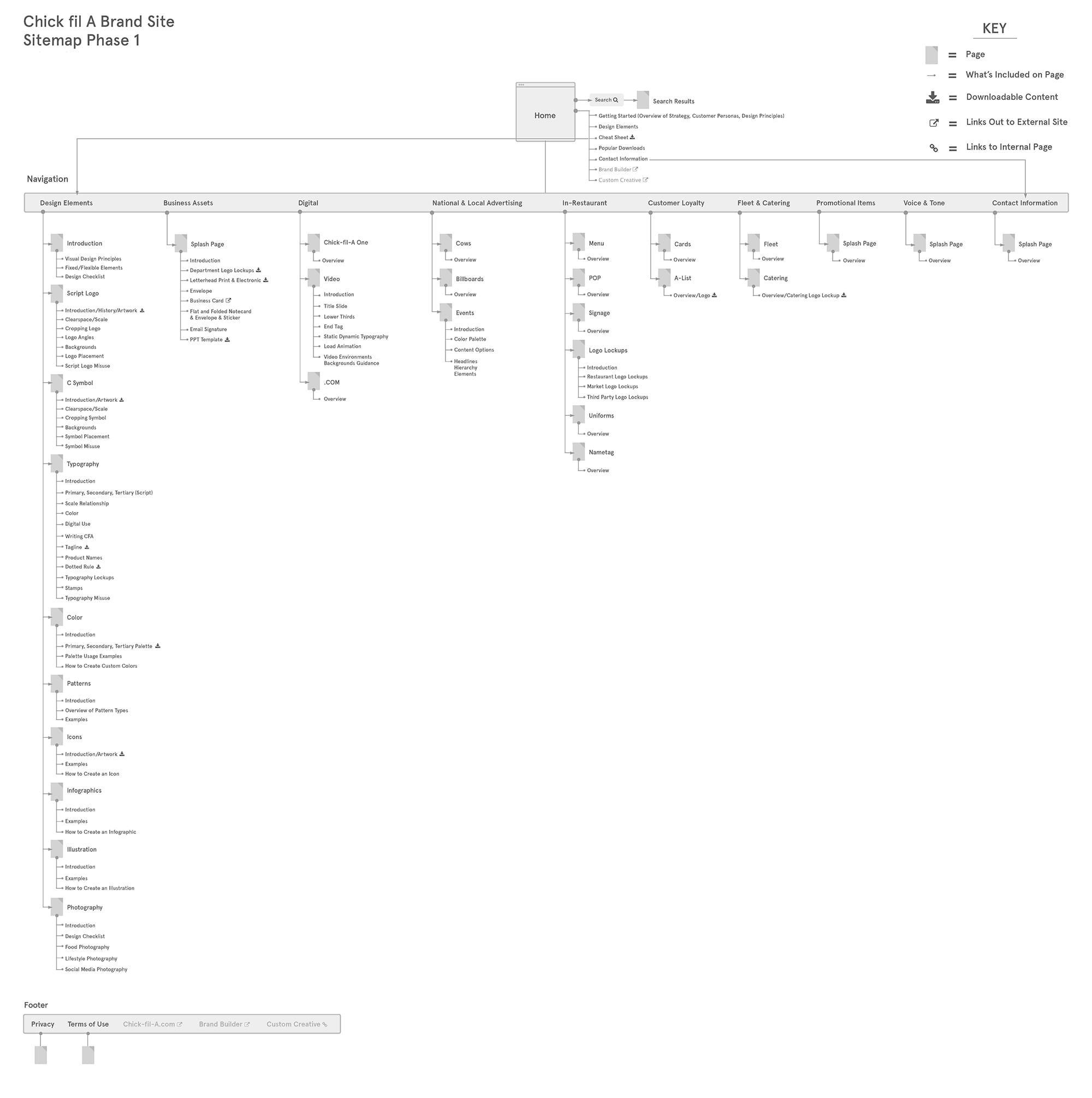
This was one of the biggest clients I've ever worked with. Patience is one of the main things that I learned throughout this whole process. It was my job to be patient and talk to the developers in Atlanta and make sure things were going right. It was my job to be the main QA lead and find mistakes on the site. This was all something I had never done before and I'm very lucky I got to do so because I grew so much from it.